YIELD Candle Collection
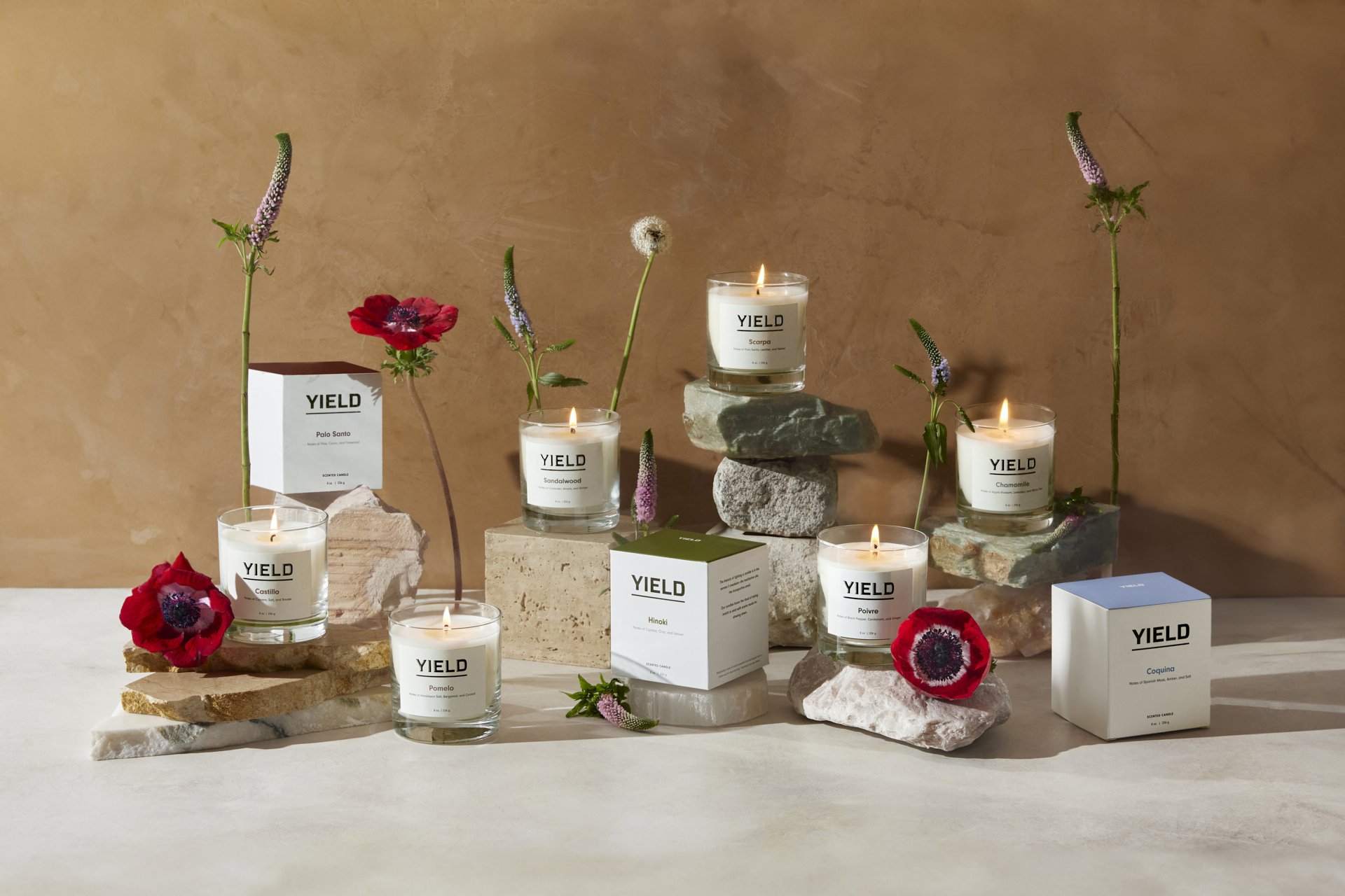
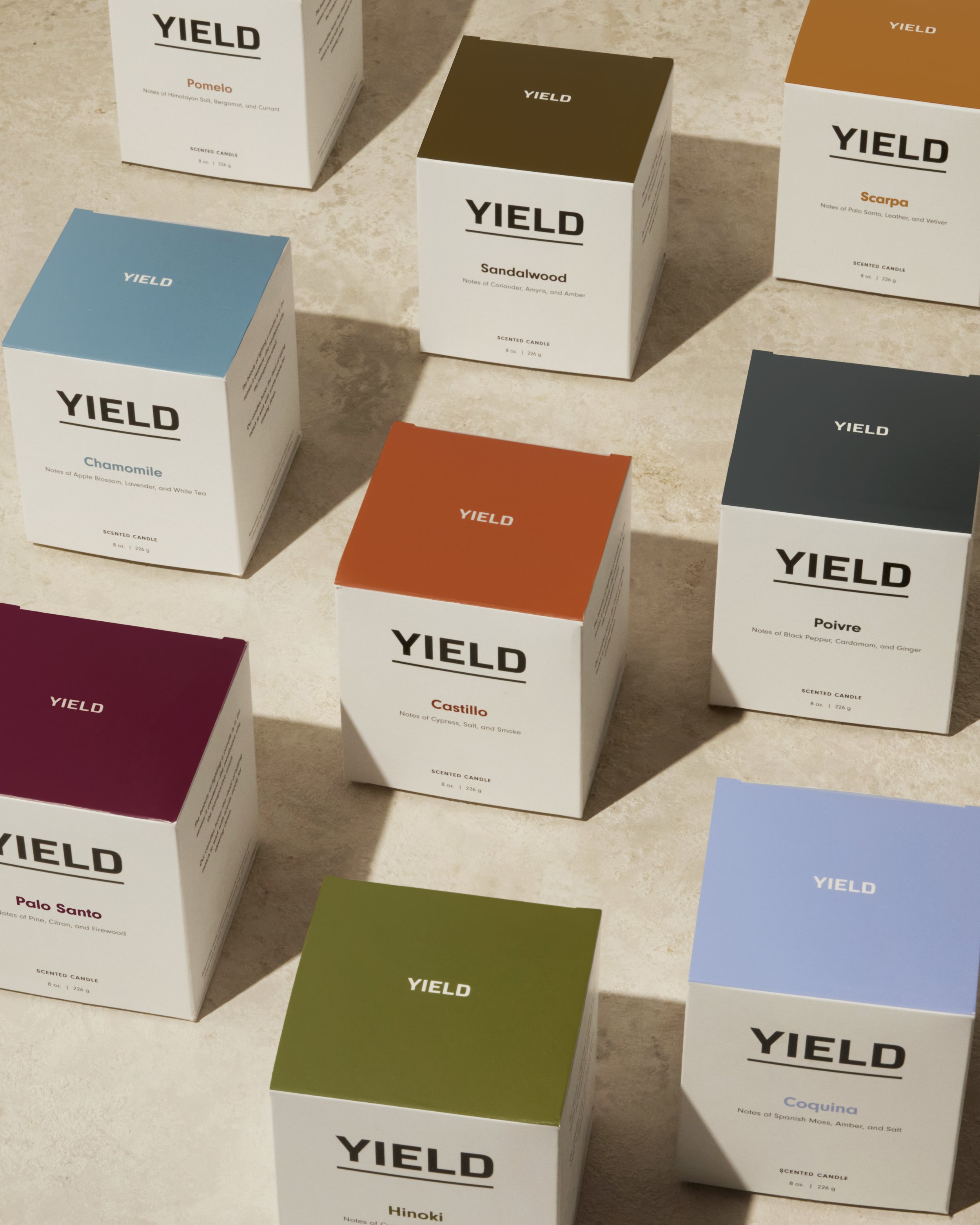
We were tasked to redesign the YIELD Candle labels and packaging. The upgraded packaging features a black foil embossed logo on the label, adding a touch of bold yet simple refinement. Every scent's name is written in a different color on the label adding quiet personality to each candle, and the box lids boast a striking array of colors, each corresponding to the unique scent within. The updated candle vessel aligns with YIELD’s distinctive glassware design language, creating a harmonious feel when a customer brings the whole product collection home. These subtle yet impactful details enhance the overall candle aesthetic, creating a more elevated look that appeals to discerning consumers. The minimalist design isn't just about aesthetics; it's about versatility. The new packaging was designed to complement a wide range of interior decor styles, ensuring that they seamlessly blend into any environment.
Role
Creative Director and Product Designer
Team
Photography: Nico Leon
Prop Styling: Rana Düzyol


